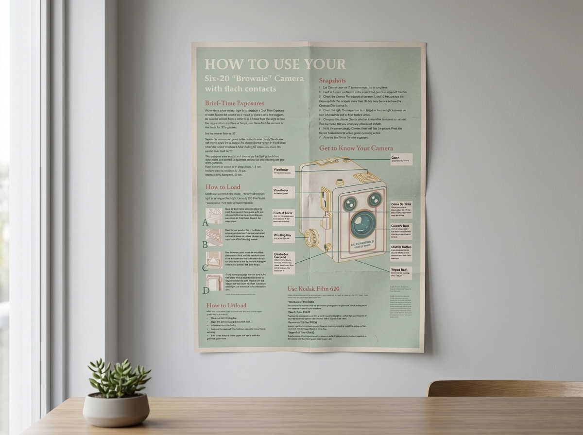
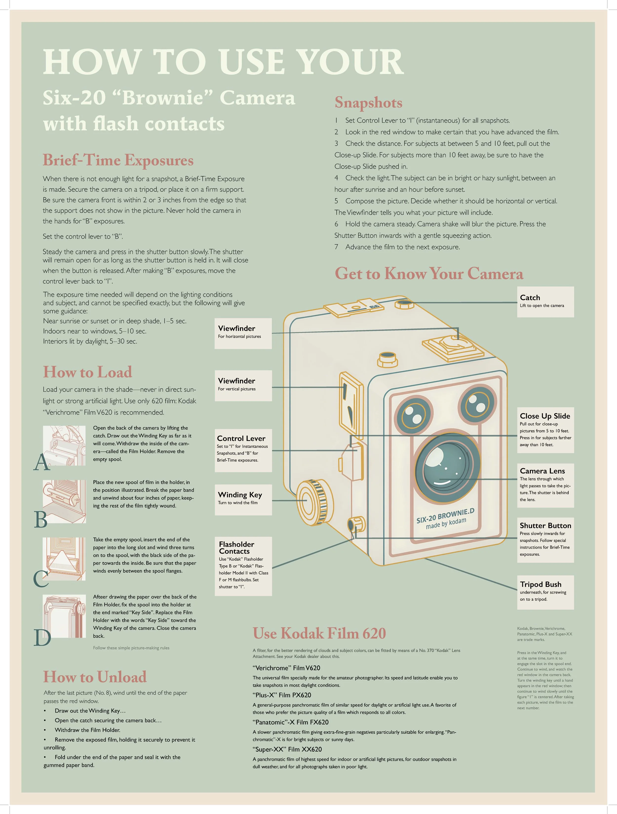
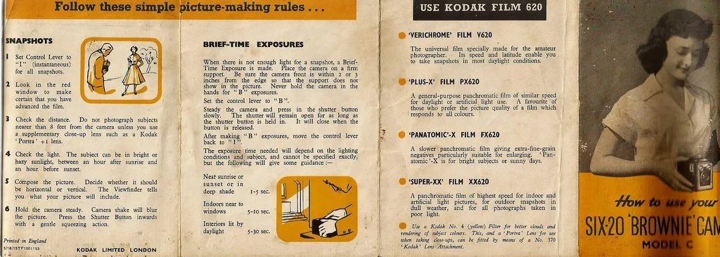
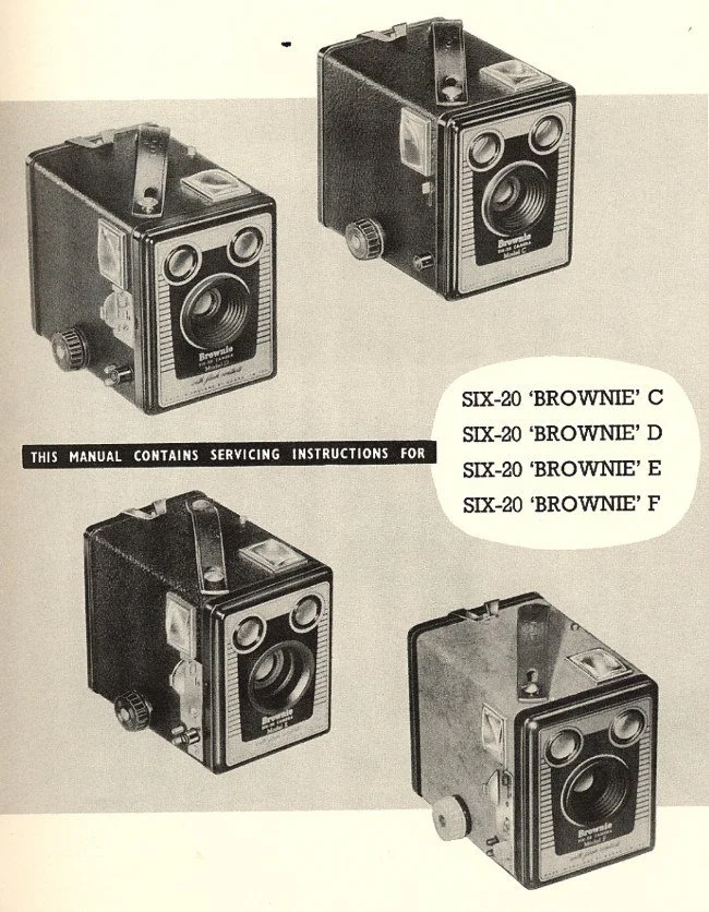
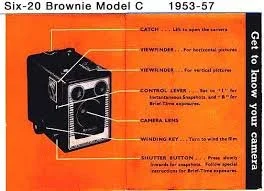
This project reinterprets a vintage camera instruction manual as an informational poster, exploring how typography, illustration, and layout can guide users through technical content. Using the Six-20 “Brownie” camera as the subject, the design organizes dense instructional text into a clear visual hierarchy that balances readability with visual rhythm.
Hand-drawn style diagrams and labeled components work alongside typographic contrast to clarify functions and usage, while a muted color palette references the historical context of analog photography. By combining instructional clarity with expressive graphic elements, the poster transforms functional information into an engaging visual experience.
Tools: InDesign, Photoshop, Illustrator.
Six-20 “Brownie“ instruction
This instructional poster marks a transition from historical reference to design practice. Building on systems of clarity, hierarchy, and visual guidance, the following projects apply these principles across different graphic contexts.